How to add a cookie consent notification to Blogger?

11 Oktober 2018 · 0 comments


Go to the link https://silktide.com/tools/cookie-consent/download-install/

Choose a theme - where the cookie consent notification should appear. There are six options - full width top, full width bottom, pop-up right with dark and light background. Choose any one you desire and click 'Continue', Customize the message and button text displayed if desired. Add a link to your cookie policy page if you have. If not, leave blank to use the default link. Click Continue, Copy the code generated as per the settings applied above

Integrating with Blogger:

  • Login to your Blogger dashboard
  • Click Layout > Add a gadget > Choose HTML/Javascript
  • Paste the code generated
  • Save
View your blog to check out the cookie notification.


Read more

Make Resvonsive Layout With CSS3

23 Mei 2013 · 0 comments
Smartphone revolution brings new features to the web development, it is time to change your website design into a responsive design instead of maintaining a separate mobile version . Responsive design will automatically adjust itself based on the screen size of the media devices. This post explain you how to use CSS 3 @media property and working with Internet Explorer using Modernizr.

Responsive Web Design using CSS3


Download Script
     Live Demo

Try live demo with different screen resolutions.

Step 1
Web layout divided into three horizontal parts are Hearder, Main and Footer. Here Header div divided into  two horizontal parts such as Logo and Nav and the same way Main div divided into Article and Sidebar.

HTML Code
<div id="header">
1 Header

<div id="logo">logo</div>
<div id="nav">links</div>
</div>

<div id="main">
2 Main

<div id="article">article</div>
<div id="sidebar">sidebar</div>
</div>

<div id="footer">
3 Footer
</div>

This is very useful for web development.

Wireframe
Responsive Web Design using CSS3

CSS
*{margin:0px;padding:0px}
#header
{
padding:20px;
overflow:auto;
}
#main
{
padding:10px;
}
#footer
{
padding:20px;
clear:both
}
#article,#sidebar
{
min-height:250px;margin-bottom:20px;overflow:auto
}

Step 2
Now working with an unorder list <ul> tag.
<div id="nav">
<ul>
<li>link</li>
<li>link</li>
<li>link</li>
....
....
</ul>
</div>

Responsive Web Design using CSS3

CSS
ul
{
list-style:none;
width:100%
}
li
{
padding:4px;
margin-bottom:5px;
background-color:#ffffcc;
text-align:center;
color:#00000
}

Step 3 - @media 768px
Working with screen media resolution minimum width at 768px

Wireframe @media 768px
Responsive Web Design using CSS3

CSS @media 768px
@media only screen and (min-width: 768px){

#article
{
float:left;
width:68%;
}
#sidebar
{
float:right;
width:30%;
}
#logo
{
float:left;
width:10%;
}
#nav
{
float:right;
width:80%;
}

}

Step 4 - @media 1140px
Working with screen media resolution minimum width at 1140px

Wireframe @media 1140px
Responsive Web Design using CSS3

CSS @media 1140px
@media only screen and (min-width: 1140px) {

#main
{
padding:20px 40px 20px 40px;
}

}

Step 5 - @media 480px
Working with Nav bar list media resolution minimum width at 480px. This is applicable for screen media resolution higher than 480px.
Responsive Web Design using CSS3

@media only screen and (min-width: 480px){

ul
{
float:left;
}
li
{
float:left;
width:16%;
padding:4px;
margin-right:8px
}

}

Modernizr
Modernizr is a JavaScript library that detects the availability of native implementations for next-generation Web Technologies. These technologies are new features that stem from the ongoing HTML5 and CSS3 specifications.
Responsive Web Design using CSS3

HTML Code
For implementing lower version browser like Internet Explorer 7 and 8, you just include modernizr.min.js after style sheet inside header tag. download link.
<!DOCTYPE html>
<!--[if lt IE 7]>
<html class="no-js lt-ie9 lt-ie8 lt-ie7">
<![endif]-->
<!--[if IE 7]>
<html class="no-js lt-ie9 lt-ie8">
<![endif]-->
<!--[if IE 8]>
<html class="no-js lt-ie9">
<![endif]-->
<!--[if gt IE 8]><!-->
<html class="no-js">
<!--<![endif]-->
<head>
<title>Responsive Design with CSS</title>
//Meta tag for devices
<meta name="viewport" content="width=device-width">
<link rel="stylesheet" href="style.css"> //Style Sheet
<script src="modernizr.min.js"></script>
</head>
<body>

<div id="header">

<div id="logo">Logo</div>
<div id="nav">

<ul>
<li>link</li>
<li>link</li>
<li>link</li>
<li>link</li>
<li>link</li>
</ul>

</div>

</div>

<div id="main">
<div id="article">Content Here</div>
<div id="sidebar">sidebar</div>
</div>

<div id="footer">
Footer
</div>

<body>
</html>

Now this code works fine with Internet Explorer lower version.

Note: Modernizer doesn't support inline CSS.

style.css
Final CSS

*{margin:0px;padding:0px}
#header
{
padding:20px;
overflow:auto;
}
#main
{
padding:10px;
}
#footer
{
padding:20px;
clear:both
}
#article,#sidebar
{
min-height:250px;margin-bottom:20px;overflow:auto
}

ul
{
list-style:none;
width:100%
}
li
{
padding:4px;
margin-bottom:5px;
background-color:#ffffcc;
text-align:center;
color:#00000
}

@media only screen and (min-width: 480px){

ul
{
float:left;
}
li
{
float:left;
width:16%;
padding:4px;
margin-right:8px
}

}

@media only screen and (min-width: 768px){

#article
{
float:left;
width:68%;
}
#sidebar
{
float:right;
width:30%;
}
#logo
{
float:left;
width:10%;
}
#nav
{
float:right;
width:80%;
}

}

@media only screen and (min-width: 1140px) {

#main
{
padding:20px 40px 20px 40px;
}

}

Note: Modernizer doesn't support inline CSS.
Credit
Read more

Menu Bar With jQuery For Blogger

17 Mei 2013 · 0 comments

In this tutorial im gonna explain how to add Bouncing  with jQuery.It  have nice hover effect. Every menu are
different  with colors. Im   using   jQuery and  HTML,  Just check out demo.Its easy to add to blogger. get my all menu bar here

1. Log in to blogger account and Click drop down.
blog-post-option
2. Now select "Template" Like Below.

Select-template

3. Now you can see Live on blog, Click EDIT HTML Button"

4. Now click Proceed button.
   
5. Find this tag by using Ctrl+F    </head>

6. Paste below code Before </head> tag

<script src='http://ajax.googleapis.com/ajax/libs/jquery/1.3/jquery.min.js?ver=3.2.1' type='text/javascript'/>
<script src='http://bloggertrixcode.googlecode.com/files/jquery.easing.1.3.js' type='text/javascript'/>
<script src='http://bloggertrixcode.googlecode.com/files/animated-menu.js' type='text/javascript'/>

7. Go to blogger and click Layout

8. Click Add Gadget and select 'HTML/Javascript

9. Paste below code.

ul{
 margin:0;
 padding:0;
}
a:link {
color: #F8F8F8;
text-decoration: none;
font-weight: bold;}
li{
 width:100px;
 height:50px;
 float:left;
 color:#191919;
 text-align:center;
 overflow:hidden;
}
a{
 color:#FFFFFF;
font-size:15px;
 text-decoration:none;
}
p{
 padding:0px 5px;
}
 .subtext{
  padding-top:15px;
 }
/*Menu Color Classes*/
.green{background:#6AA63B url('https://blogger.googleusercontent.com/img/b/R29vZ2xl/AVvXsEgOoF4xxVUl8vobNXXpWT0LOCWUB3mTb9itMfTME9Yg0tz_hZYtUoJjUfiJOoZ26iaoWyYwlkJTC2x0vXqNr3BYTJrSFWJR-6uebOYmJ7BM8gqjgqYyFuk2kXcc7dWAi5jCGlJYcVWWJeA/s1600/btrix_green-item-bg.jpg') top left no-repeat;}
.yellow{background:#FBC700 url('https://blogger.googleusercontent.com/img/b/R29vZ2xl/AVvXsEikJUoZUluWpnwz8UKTmy8IrKULc-m3omQojw-SO6yed0fcUYprHaseqjkXwaxk1SbklVadIW_raA4AVDk4trzB0CVftVVvhsMsLip1UNcs4e-8pZEAFK2qxBTRafbt2VsAb7rXposRUUY/s1600/btrix_purple-item-bg.jpg') top left no-repeat;}
.red{background:#D52100 url('https://blogger.googleusercontent.com/img/b/R29vZ2xl/AVvXsEhH9SeIKqW0M-UnIRplHr_l3CKoZ-NLev7Vw7xmXWsonvlCAECNu22ECoJd1sTR2wEZPHTn_ZjxgSrVxToT5ohZTFWrzmPAwMUTDkqtLGprA835DOBT7hQRdlvnEKoqQkxnWzLFXh9oVco/s1600/btrix_red-item-bg.jpg') top left no-repeat;}
.purple{background:#5122B4 url('https://blogger.googleusercontent.com/img/b/R29vZ2xl/AVvXsEh9dBig9iheYyhEKR8nUfQABgmRbtsyhWDf_j4RSaxeosJ4bc2rEyu8AUeIrny4R1f8f4Zujth53MFDMNXwVlSn_Kb0FpRLLUwYuJqjWvwlyzin_T3B1QbdnViWfR5sTUKD0KVug0VVh4w/s1600/btrix_blue-item-bg.jpg') top left no-repeat;}
.blue{background:#0292C0 url('https://blogger.googleusercontent.com/img/b/R29vZ2xl/AVvXsEi6zQQEu28Zgw8A52iowZruyecRwo1gplFu7SlysMIDe00j3kLdCc0sbW-tnzLdiuwOx0QtUgi8OhqZFFpeWEQeQ0g1AFFU6rTzUpzg_RMKvNOcpRrbLEcAHItqXXwtlx-R4YBAlBb9wZQ/s1600/btrix_yellow-item-bg.jpg') top left no-repeat;}
</style>
<ul>
  <li style="overflow: hidden; height: 50px; display: block;" class="green">
   <p><a href="#">Home</a></p>
   <p class="subtext">The front page</p>
  </li>
  <li style="overflow: hidden; height: 48px; display: block;" class="yellow">
   <p><a href="#">About</a></p>
   <p class="subtext">More info</p>
  </li>
  <li style="overflow: hidden; height: 50px; display: block;" class="red">
   <p><a href="#">Contact</a></p>
   <p class="subtext">Get in touch</p>
  </li>
  <li style="overflow: hidden; height: 50px; display: block;" class="blue">
   <p><a href="#">Submit</a></p>
   <p class="subtext">Send us your stuff!</p>
  </li>
  <li style="overflow: hidden; height: 50px; display: block;" class="purple">
   <p><a href="#">Terms</a></p>
   <p class="subtext">Legal things</p>
  </li>
 </ul>
 <script type="text/javascript">
 var gaJsHost = (("https:" == document.location.protocol) ? "https://ssl." : "http://www.");
 document.write(unescape("%3Cscript src='" + gaJsHost + "google-analytics.com/ga.js' type='text/javascript'%3E%3C/script%3E"));
 </script>
 <script type="text/javascript">
 try {
 var pageTracker = _gat._getTracker("UA-6444047-1");
 pageTracker._trackPageview();
 } catch(err) {}</script>
Replace # with your links.

10. Now save your HTML/Javascript'.
Read more

How To Make Sparate Box Posts in Blogger

15 April 2013 · 0 comments
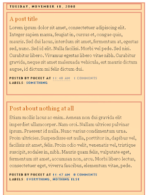
In this tutorial, we're going to divide (separate) our posts in boxes (frames), so each post will have it's own "house", and you'll be able to see background between them. See below what I'm blabing about:


Ok. You should keep in mind:

► this is the example for the Blogs that already have a customized (stylized) Post area
► this example was made in Minima Blogger template (so your code may be a bit different, but the procedure is the same)
► it doesn't matter if you have "heavily" customized template, you can apply these setting anyway

UNDERSTAND THIS
....main-wrapper defines the Post area in Blogger Template. The whole idea here is to copy the style of main-wrapper, and to apply it to elements inside of it.

....now, the whole section of "main-wrapper" looks like this (in my example):
#main-wrapper {
background:#FFDEAD;
border: 1px solid #E9967A;
padding-right:7px;
padding-left:7px;
width: 410px;
float: $startSide;
word-wrap: break-word; /* fix for long text breaking sidebar float in IE */
overflow: hidden; /* fix for long non-text content breaking IE sidebar float */
}
...the part in white is default, and I've customized template a bit with part in orange.

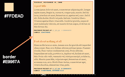
...I've also added some padding so the text is not too close to the edge. Read more about adding borders in Blogger here.
...your style will be different, of course. But this doesn't really matter .

So, you want to keep the same style (design) and separate posts into individual boxes. Here's:
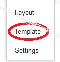
HOW TO DO IT
First thing you should do is back up your current Blogger template. Then go to:
DASHBOARD ► LAYOUT ► EDIT HTML, and in the code section, find the following line of code:
#main-wrapper {
...in my example the whole section looks like this:
#main-wrapper {
background:#FFDEAD;
border: 1px solid #E9967A;
padding-right:7px;
padding-left:7px;
width: 410px;
float: $startSide;
word-wrap: break-word; /* fix for long text breaking sidebar float in IE */
overflow: hidden; /* fix for long non-text content breaking IE sidebar float */
}
...now, I'm going to copy the style (in orange) and paste it in my main-wrapper elements (find the following lines in code):
h2.date-header {
margin:1.5em 0 .5em;
}

.post {
margin:.5em 0 1.5em;
border-bottom:0px dotted $bordercolor;
padding-bottom:1.5em;
}
....after pasting the code, it should look like this:
h2.date-header {
margin:1.5em 0 .5em;
background:#FFDEAD;
border: 1px solid #E9967A;
padding-right:7px;

padding-left:7px;

}

.post {
margin:.5em 0 1.5em;
border-bottom:0px dotted $bordercolor;
padding-bottom:1.5em;
background:#FFDEAD;
border: 1px solid #E9967A;

padding-right:7px;

padding-left:7px;

}
....you can see the added code in orange.

Next thing is to hide (or delete) the copied style from "main-wrapper". If I don't do this, my template will look like this:

....to avoid it, I'll hide the style in "main-wrapper" using /* and */....in the code it's like this:
#main-wrapper {
/*background:#FFDEAD;
border: 1px solid #E9967A;
padding-right:7px;
padding-left:7px;*/
width: 410px;
float: $startSide;
word-wrap: break-word; /* fix for long text breaking sidebar float in IE */
overflow: hidden; /* fix for long non-text content breaking IE sidebar float */
}
...alternately, you can just DELETE the style from the main-wrapper...
...now, the style for main-wrapper is disabled, and you can see a gap (a Blog background, in fact) between your posts...

FIX
To align your sidebar with the post section, find this part of code:
h2.date-header {
margin:1.5em 0 .5em;
..and change it to:
h2.date-header {
margin:0 0 .5em;
Save Template.

ADVICE
► In this example, the date has it's own box. Hm. You can change this if you don't like it. Read the instructions on:
How to move the date under the post title in Blogger

► If you have switched to Embedded comments below posts, you should consider customize them a little bit......Why? Because your Blog background may come in the way, causing low visibility of the comments and comment form....It depends on your background color. You'll get it.
Read more

Widget

Mengenai Saya

Diberdayakan oleh Blogger.